Like this theme? Rate it from the download page & we’ll keep bringing new features & updates!
Version 1.2.3 Now Available – See update details below
Version 1.2.4 – Pending
Gridcraft: The Modern Fullscreen Grid & Portfolio for WordPress
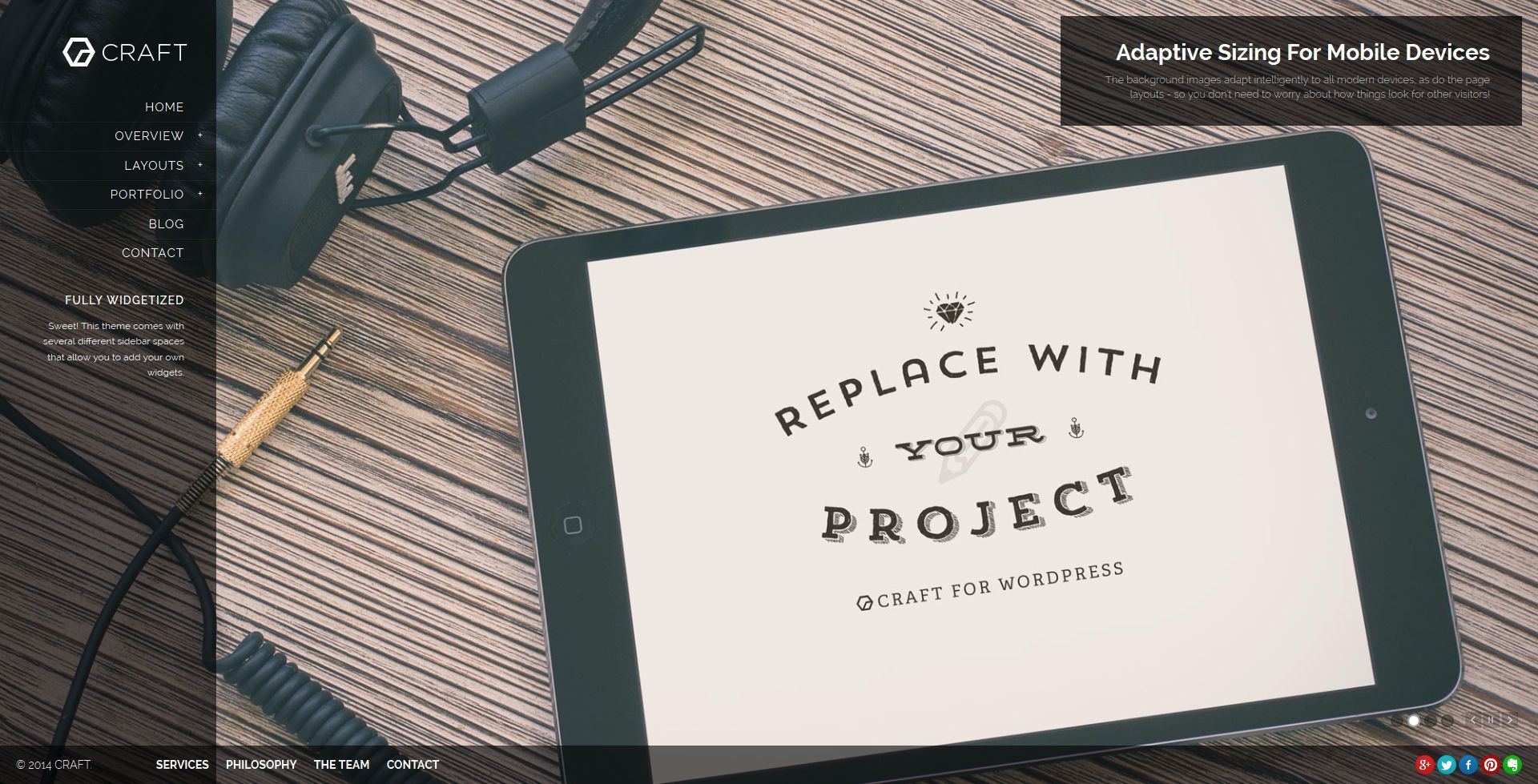
Gridcraft is a fullscreen responsive WordPress theme for creatives, photographers, illustrators and designers. You can use it for other projects, of course, but we specifically created this one for folks that want to show off great images, videos, and other visual projects in a unique full-screen layout.
Built on the Mythology Engine, a new WP theme system that seeks to cut down the time it takes to launch a custom site exponentially.
2 Powerful Background Sliders with Fully Collapsible Content Columns
Perfect for displaying projects on any device. One slider that’s incredibly easy to build on the fly (with custom captions, transitions, and other handy basics). Another using Revolution Slider that gives you full control to add background videos, layer effects, transitions, hot spots and more!Over 30 Base Layout Configurations
The theme comes with over 30 different base layout configurations & page layouts. Within those, each individual page layout has a variety of specific options to truly customize the experience. Traditional pages can align and stretch a variety of ways. Each page can have it’s own background slider (with collapsible content columns) to create a fullscreen project viewing experience. The header/navigation column can swing to the right or the left (and multiple alignment possibilities within). All of this is built with our easy to use visual options system. There’s so much room for activities!The Full Featured Blog
Just because you want to have a rockin’ portfolio layout doesn’t mean that you can’t also produce quality written material too! Create a rich blog experience with a variety of layout options and all of the SEO and Social Sharing goodness that comes along with it.
The Full Feature Stack
The theme comes pre-packaged with tons of features that’ll make it just right for your project… here’s just a taste:
Highly Customizable Post Modules with Skeleton Grid 2
Create multiple portfolio effects within the same site. Customize everything – including the grid layout, the module sizes, content alignment, title, categories, excerpt, icons, the hover effects, custom post colors, zoom effects, and lots lots more! All using our custom built, incredibly easy to use Grid Builder system.
Mythology Background Slider
Create your own quick, responsive “background sliders” for any post, page, or template on the theme. Select from a variety of transition effects, navigation styles, captions, and lots more!
Visual Composer
Create your own custom layouts using over 30 different content modules ranging from image-sliders to text blocks to videos and maps. Visual Composer is the most popular visual editor available to WordPress and it’s bundled in the theme. Updates are be included for free with each theme-version update.
Live Search
Try typing in the searchbar (in the sidebar or on the “tophat”). The Live Search feature allows users to instantly skim your site for relevant material without every loading another page.
Revolution Slider
The premiere slider plugin for WordPress – completely overhauled with a brand new, vastly improved user interface that blows the older versions of this plugin out of the water. The new Revolution Slider is, quite simply, the best slider we’ve ever had the priveledge of using. Updates are be included for free with each theme-version update.
HTML5 SEO
We re-wrote our entire theme-base from scratch to include the latest, most relevant HTML elements and tags to allow for the best possible search engine results.
Multi-Language Support
The entire theme has been fully internationalized and prepped for your language translation. Just follow the usual translation process and the theme will do the rest.
A Streamlined Workflow
This might be the first theme you encounter that actually advertises LESS features. We’ve pulled out every redundant, confusing, or buggy feature from our old theme framework and boiled down this theme to the least amount of complexity possible. Think of it as a Zen Garden in theme format.
1,000’s of Fonts
Use the integrated Google Fonts library to see instant Live-Previews of how your site looks with any font you want before you hit “Publish”. If Google Fonts aren’t enough, we integrate seamlessly with Typekit, Fonts.com, and other popular services.
Custom CSS & Script Injection
Got something custom that you want to drop in? Simple. Just drop them into our theme control panel and the theme will do the rest of the work for you.
Built with Ordinary People in Mind
Our goal is to deliver a theme that anyone can use & customize, without any need for 24/7 customer support or long-winded documentation manuals. You can import our theme demo content if you want a head start, but the theme has truly been designed to be answer any of your questions as you use it, so don’t fret if you don’t know how to code.
Built with Developers in Mind, too!
Our code is clean, organized, and well commented. Everything has it’s rightful place in this theme, and making advanced customizations to templates, stylesheets, and functions has never been easier.
Beyond Responsive
We were one of the first theme crews to dabble in ‘responsive design’ way back in the day… so we know a thing or two about how to do this properly. Fluid grids are used at larger breakpoints, and fixed widths are used on smaller devices to ensure ideal spacing. The type size shifts on smaller devices to be larger and easier to read, and images and other media are sandboxed to prevent anything from breaking the layout.
REM Typography & Layouts
The problem with Pixels are, they absolutely do-not-scale in Internet Explorer. Furthermore, with the onset of Responsive Web Design, having fonts that scale (in relation to the screen width) has become paramount. Percentages (%) and EM’s are better, but they’re tricky and compound. Still not an answer. A real solution? Use the REM. (Source – Greg Rickaby)
JetPack Comments, Carousel, and Extra Widgets
Nearly all of JetPack works well with this theme (the Tiled Galleries are the only exception since those aren’t responsive) – if you want to start using the next level of WordPress functionality, you’ll get it here.
The Theme Control Panels
This theme has been built on the Mythology Engine, a foundation theme from MDNW that has the primary goal of creating the fastest site launch process possible. It does this in a few ways:
Theme Options, Re-envisioned
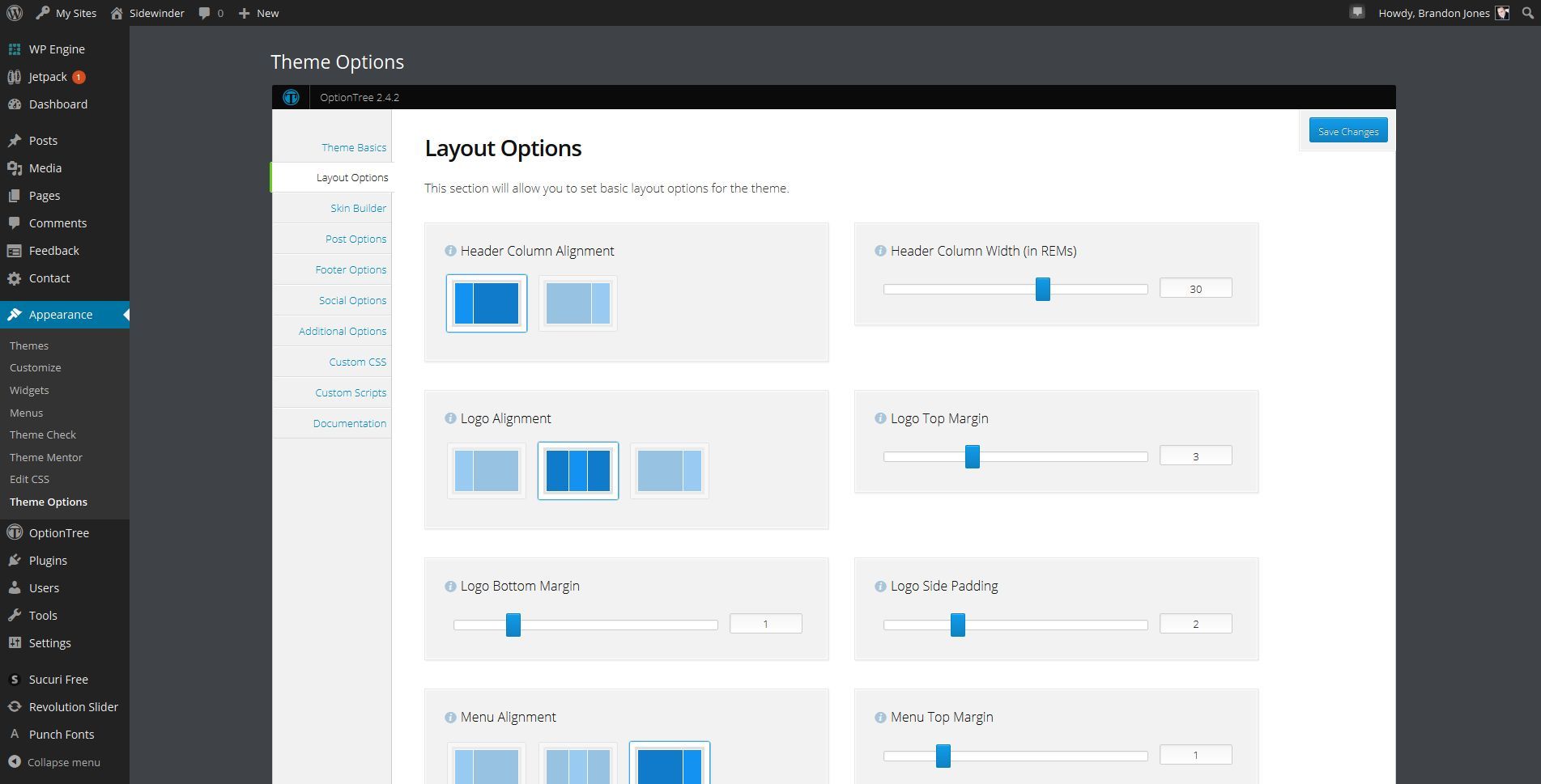
Less is truly more. We’ve stripped all skinning options from our primary theme control panel in order to create a swift, responsive, uncluttered way to manage the key aspects of the theme. This is what the admin panel looks like:
We cut out the bloat. The full set of options includes:
- 10 Header Layouts
- 4 Default Page Layouts (Visual Composer handles all other layouts ;))
- Logo & Favicon Uploader
- Theme Highlight Colors
- Options Skin Override
- Breadcrumbs & Pagination Toggles
- Top Hat Toggles & Content Fields
- Footer Toggles & Content Fields
- Post & Page Element Toggles (date, tags, categories, etc.)
- Social Media Icons
- Custom CSS
- Custom Javascript
In addition to the Theme Options panel, this theme also integrates a handful of Page & Post options that allow your to override any global rules for that one page or post. These panels will show up on any Page or Post editor, underneath the basic content editor. In the event that they do not appear, make sure that you have enabled them from the top-right “Screen Options” panel. These panels will allow you to override theme-level options on individual pages and posts.
Theme Skinning with Live-Preview
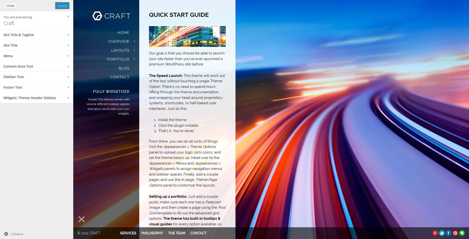
Eliminate the guesswork from customizing the theme. Built on the WP Theme Customizer API with some special tricks blended in, you can change just about every typographic or color across the entire theme… there’s no need to reload the page on the front-end though – the Theme Customizer will show you an instant preview of what your changes look like right there on the same screen.
Here’s what the panel looks like:
The full library of Google Fonts is included in the Theme Customizer (and yes, live-preview works on the font-faces too). Just open up the customize panel and start playing!
Perfect for studios, agencies, photographers, designers, illustrators, restaurants, pubs, sushi, fine dining, bar & grills, bakery, cupcakes, wine, doctor’s offices, lawyers, food blogs, design studios, print shops, seafood, coffee shops, mexican, steakhouse, pizza, italian, white table cloth, local, open table businesses, yelp businesses, and lots more!
Changelog
/**************************/ CHANGELOG : GRIDCRAFT /**************************/A Humble Request of Buyers - If you appreciate these updates, please help me out by giving the theme a 5-star review. I do my best to kick out frequent updates based on user feedback, and every rating helps to let new buyers know that the theme is being both supported and improved on a regular basis. THANK YOU!!! If you encounter any issues or have questions, please let me know in the comments area. I'll do my best to get back to any bug reports as soon as I can (keep in mind I have newborn twins right now though!). I'm also enlisting the help of ThemeIsland for theme updates and bug reports.=======VERSION 1.2.4 -- 06/30/2015- UPDATED: PrettyPhoto js script to 3.1.6 - prettyPhoto XSS fix- UPDATED: Mythology Core 1.1.5 - UPDATED: WPBakery Visual Composer 4.5.3 - prettyPhoto XSS fix- ADDED: Fallback for VC Separators on Mobile (media-queries.css 269)VERSION 1.2.3 -- 5/12/2015- UPDATED: Show featured image option for post/blog page template- ADDED - Responsive fallback styling for VC single image- FIXED - XSS Vulnerability: - UPDATED: Mythology Core 1.1.3: - WPBakery Visual Composer 4.5.1 - Revolution Slider 4.6.93 - OptionTree 2.5.5 - TGM-Plugin-Activation 2.4.1 - Plugin-loader.php sources updated from http to https - Plugin-loader.php sources updated to use "latest-stable" VERSION 1.2.2 -- 3/25/2015- UPDATED: Styles for Post Grid visibility options (plugins.css 244 - 248) - Thanks Stephan-Schmidt!VERSION 1.2.1 -- 3/20/2015- Updated Mythology Core plugins updated: - OptionTree to Version to 2.5.0- UPDATED: OptionTree Loader - WPML support - this fixes the ot-meta-boxes.php error WPML users were seeing- FIXED/ADDED: Custom scrolling patch for Responsive Menu- FIXED: Layout options for logo margin top/bottom fixed- FIXED: Backslider controls z-index issue on Chrome- FIXED: First slide caption not displayed for bg slider- FIXED: Mobile scrolling on Portfolio/Post-Grid- FIXED: Styles for menu/sub-menus/list items with children when right header layout is chosen- UPDATED: BS thumbnail controlVERSION 1.2.0 -- 01/28/2015- FIXED: Styles-gridcraft.zip plugin activate location- UPDATED: Visual Composer to Version 4.4.2VERSION 1.1.9 -- 01/28/2015- UPDATED: Post Grid page template layout options- UPDATED: Post Grid template extended support for content options- UPDATED: Standard Page layout options- FIXED: Page content width bugVERSION 1.1.8 -- 01/23/2015- FIXED: Safari display for content v. header structure/layout/width seen on newer versions- UPDATED: The styles-gridcraft plugin for Appearance > Customize functionality- UPDATED: Child themeVERSION 1.1.7 -- 01/21/2015- UPDATED: Visual Composer to Version 4.4.1- FIXED: Full width page layout- FIXED: Scrolling on mobile devices- FIXED: Revolution Slider content moduleVERSION 1.1.6 -- 12/17/2014- Updated Mythology Core plugins updated: - Visual Composer to Version 4.3.4 - Revolution Slider to Version 4.6.5 - OptionTree to Version to 2.4.6 - TGM Plugin Activation is up to date with Version 2.4.0- FIXED: Missing php tag syntax error- FIXED: Style.css tag warning- FIXED: Demo Bar- FIXED: Notice: Undefined variable backslider_mode- FIXED: Notice: Use of undefined constant url in blog.php, page.php- FIXED: Notice: Trying to get property of non-objects in post-grid.php, blog.php, page.phpVERSION 1.1.5 -- 7/29/2014- Fixed the width for page-templates (specifically, the post-grid not filling the width of the page in some option-scenarios).- Patch added to help fix Visual Composer "overlap" logic where rows were overlapping each other.- Added new Page/Post/Theme Option that allows you to manually set the "mobile content top margin" for each page/post or the entire theme.VERSION 1.0.1- Updated to Mythology Core 1.1.0.VERSION 1.0.0- Original Gansta


